We all see dozens of websites every day. There are many great ones and even more not so great ones. Especially when it comes to online teaching websites I found that many online teachers are needlessly complicating and cluttering their websites, whereas a more user-centric approach can do real wonders in increasing student engagement and of course bookings of lessons.
The Myth Of The Perfect Website
A common misunderstanding is that in order to have a great website you need a) an artistic background, b) otherworldly programming skills and c) a lot of money.
These are at least the excuses that you hear when people speak about their sites: “I’m not a designer.” – “I’m not a programmer.” – “My budget was really low.”
But in the end those are just excuses. You neither need to be a Picasso, Zuckerberg or Rockefeller. All you need is common sense and a willingness to experiment.
(I always recommend to purchase your own domain and webspace, but for the sake of example you can also go the route of free)
1. Register a WordPress Site
Go to http://wordpress.com to register
2. Name Your Website
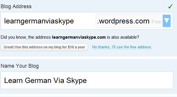
You can still change this later, but please note that I put in my keywords (learn, german, skype) both in the title and in the address. This can help search engines to find me better than just calling it Lederhosen or whatnot.
3. Choose a Theme
Stick with the default for the beginning. It’ll help you not to get distracted early on by too many visual elements. You can also always change it later.
4. Preview Your Site
5. Change/kill the Header
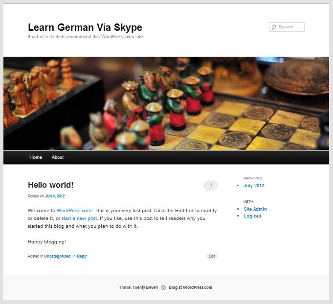
This theme is great but the header graphic is a bit blockish and takes up too much screen real estate. We don’t want people to have to scroll down all the time.
You can kill/change the header under Appearance->Header->Remove Header image
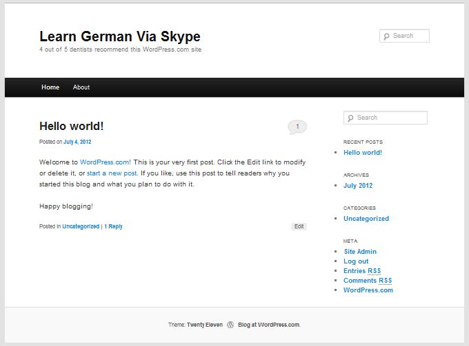
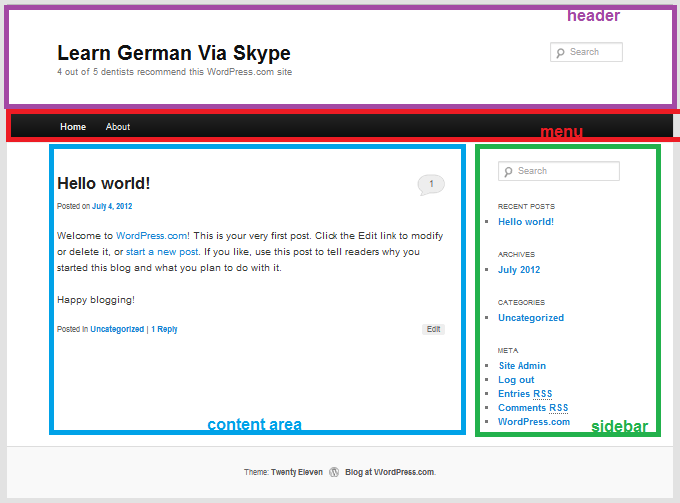
Now, this is a lot better, since you can get a good overview of the important elements. I’ve colored them for you here:
6. Create a Welcome Page
As you can see the content area shows blog posts by default. Since we’re aiming at building an online teaching website, the blog should not be the first thing that people see, we can include it deeper within the page, later.
Go to Pages -> Add New in your WordPress Dashboard and create the face of your website.
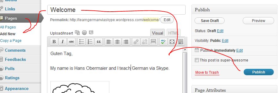
(a picture and a bit of text is enough. This is about a first impression of your online teaching approach/personality, not about details)
7. Make Your Welcome Page The First Thing People See
After creating this first page, your site will still show blog posts as default in the content area. In order to change that, go to Settings -> Reading and select the following:
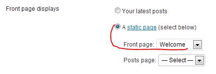
Don’t forget to click “Save Changes”
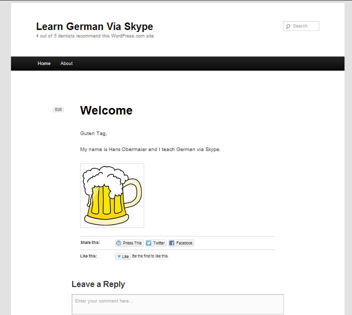
We’re getting there. One thing that is a problem here, though is the “leave a reply” field below. We don’t want to confuse people and have them think this is a blog post. This welcome page like the entry hall to your online teaching business, not a spot for debates.
8. Disable Comments For Pages
This is a bit tricky for beginners, because it’s hidden, but its’ super simple.
Go to Pages -> All Pages and edit your Welcome Page
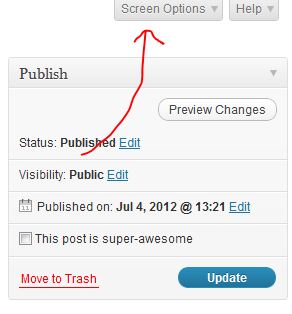
On top of the page you will find this little Screen Options tab. Click it.

This will allow you to show a lot of different options that are usually hidden by default. Tick discussion and close the screen options tab by clicking on it.

Now, under the field where you wrote your page content you will find another box has appeared, titled “Discussion”. Just untick where it says “Allow comments” and you’re good.
Note: You just have to do this once. From now on this Discussion module will always appear when editing posts or pages.
9. Removing More Clutter
Now it should look better…
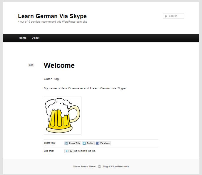
Aah, that’s better. The Share this/Like this section is still a bit confusing for the eye (we don’t want people to get lost on Facebook/Twitter but be engaged with our site!)
Here’s how to get rid of that, too. Under the module “Discussion” from the last step there’s another module called Likes and Shares.
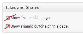
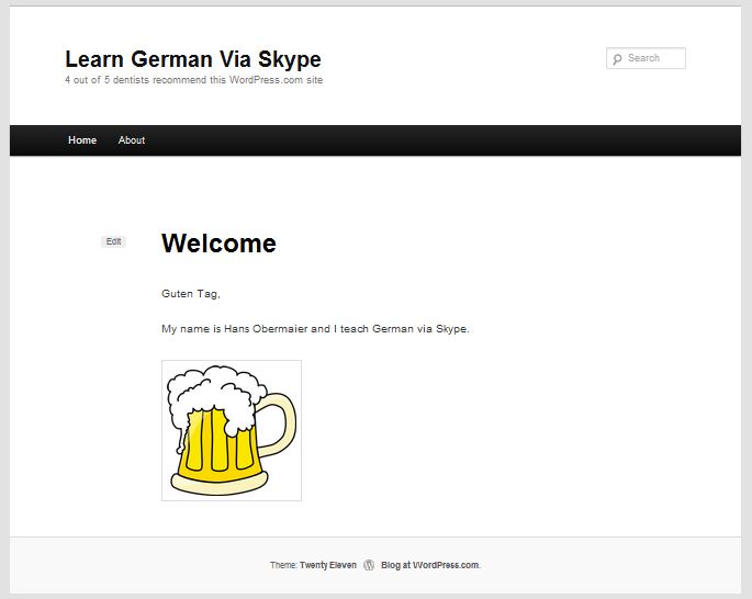
Just untick both options to get a clean page.
And don’t worry, there’ll still be lots of other ways to put Social Media buttons on other parts of your site. No need to feel guilty for being “unsocial”. What counts for now is distraction free design. Check it out:
10. Bask in the Glory of Your New Site
So far we’ve mostly removed stuff, but we’ve laid the groundwork for a great online teaching website. It’s okay to be proud! 🙂
TO BE CONTINUED…
In the next post I’ll show you how to add a contact form, buttons for lesson payments and more…
…
Was this helpful for you? What else would you like to see? Leave a comment!

