[PART #1] – [PART #2] – [PART #3]
Welcome to the fourth part in our short series about creating ebooks with open source tools. (If you missed the last one, click here). Today I’d like to talk a bit about cover design. To many people design is a matter of taste, but it’s much more than that. A well designed book cover communicates authority and emotion, part of the nonverbal factors that help make a sale.
There is a common belief that you have to be a classically trained artist to create a good cover, but if you simply follow a few rules, everyone can do “professional” cover designs.
Personally, I don’t have any illusions about being specifically innovative when it comes to graphic design, so I rely on a minimalist approach. Put differently, the less there’s happening on the cover, the less can go wrong!
I’ve seen many authors who try to imitate the intricate cover designs of bestseller covers, complete with customized font styling, extensively photoshopped graphics and layers of effects and shading. If independent authors try to compete with these products of experienced designers the result is often a mess. This is why, in most cases, simple is better!
Besides, the book cover in the ebook age has a completely different function than for paperbacks.
Book Cover As Icon
It might sound strange but most of the time your readers will not see your book cover anyway. It will certainly not constantly appear while reading on an e-reader or tablet. And if it does it will show up only as a little thumbnail sized image. Also when it comes to listing in stores, in most cases your book cover will take up very little screen real estate, so from the beginning we have to choose an approach that will look good when reduced to a small size.
As a rule of thumb, designing an ebook cover is much closer to creating an icon than to producing a poster. Nobody will see the painfully chosen hue of gold you chose for the ring on the finger of your protagonist, unless the cover shows a close-up of the hand. There’s no need to get lost in too many details. Instead, create a cover that is iconic. Not only will it be easier to design technically, but it will also have great recognition value, even if shown at small sizes.
Simple Tools With Great Results
The following approach to cover design can be applied to any software, whether it’s Photoshop or simpler software. Since this tutorial series is based on open source tools, I will take Open Office Draw as an example, just to show how great results can be achieved with a minimum of technical knowledge.
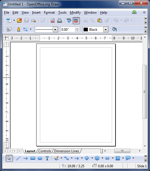
starting with an empty document…
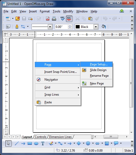
first let’s set up our page by right click > page setup
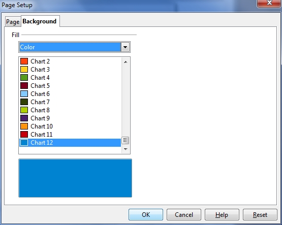
under background, let’s choose a simple color for now.
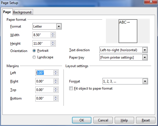
under the “page” tab, make sure to set all margins to 0.00 to avoid white spaces
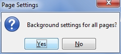
if you get asked this, say Yes
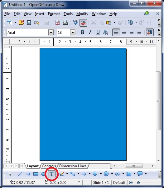
on our new page, click the T icon and draw a text field rectangle…
… and write your title within
…maybe center it…
…change the font-color by clicking on… “Font Color”…
and maybe select white for now.
Since we’re at it, why not add a little shadow effect, as well.
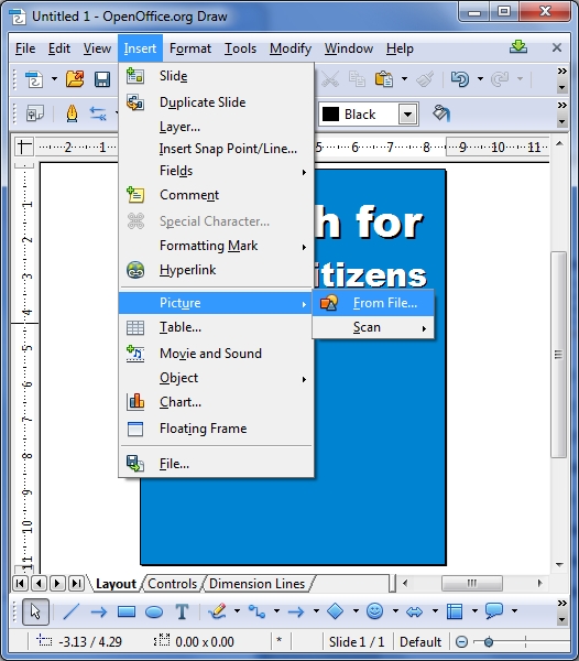
Next up, let’s add an image to make things more interesting.
I chose a simple photo from morguefile.com for this tutorial.
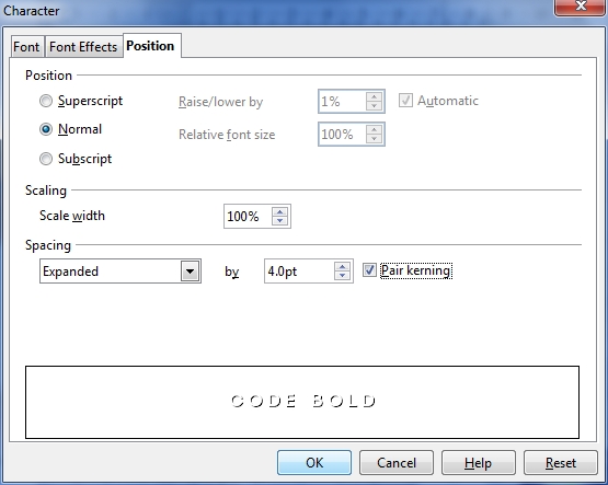
…And here is the same graphic, but I changed the title font to something more respectable. But the letters are a bit glued together…
…so I do right click > Character and set the Spacing to 4.0 and hit OK
Here are the letters with spacing, and also another photo for the center.
Next up I added the author name under the picture in the same font.
To structure the cover a bit more, we are going to add dividing lines now by clicking on the rectangle icon and drawing a narrow rectangle over the “seams”
right click on the rectangle > Area to control its color…
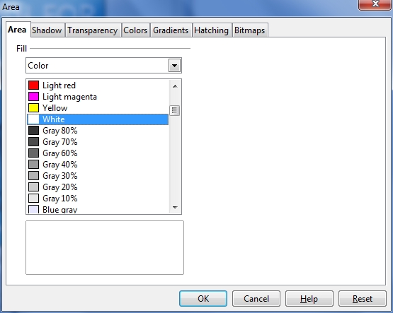
let’s also set it to White for now, then hit OK.
Now do a right click > copy on the rectangle…
and paste it…
…dragging it over the bottom “seam”.
Once you’re done, simply export the image as JPG (make sure to set it to full quality) or TIFF
here’s another variation of the same design with a different photo
and yet another photo.
Some More Experimentations
If you are bored by this three-tiered structure, why not try something else. First, delete everything except for the title and the author name.
Then add a circle by selecting the Ellipse tool, hold the left mouse button and start dragging. Note: to get a perfectly round circle make sure to hold the Shift key on your keyboard while dragging.
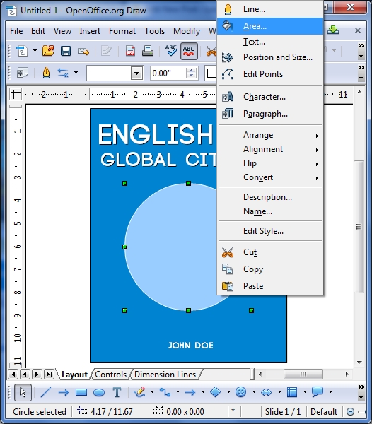
Next, right click on the circle and select Area
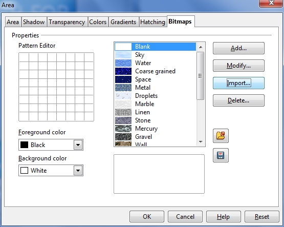
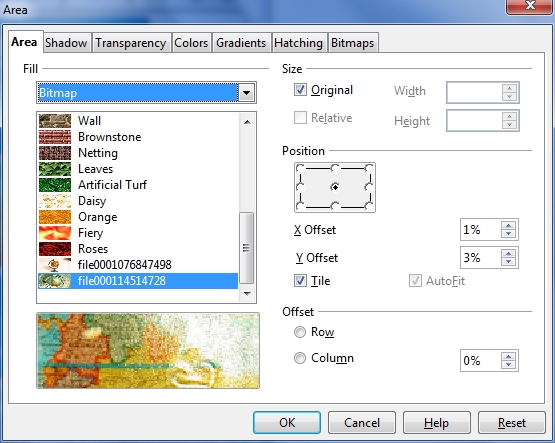
In the popup, go to Bitmaps and import your own photo
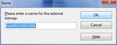
(the program will ask you for a name, this can come in handy if you import lots of graphics, for now the default is okay). Click OK when done.
Voilá! Now we have an image in a circle which has great iconic value! Take a few steps back from the screen (or resize the image) to do the thumbnail-check.
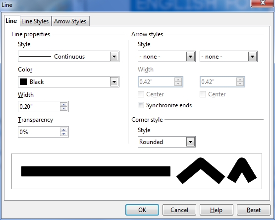
Next, let’s add a border to the image by right clicking and selecting Line
For this example I chose Black and a width of 0.20
I’m not fully convinced, but the idea is not bad… What if…
we substitute the image within the circle and make it a bit smaller and make the border white? That’s better, isn’t it?
(to position the image within the circle use the X and Y offset controls)
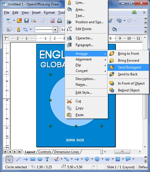
Now let’s add another circle on top of our globe (like we did above) and send it backward by right click > arrange
Mmmh, alright…
Now we could add a triangle behind it, maybe in orange to add some contrast?
and maybe change the Area (right click on triangle) and give it a gradient to make it more interesting.
Summary
While these examples certainly are no Picassos, I hope that they nevertheless gave you some ideas how to realize quasi-professional covers in very little time and with no previous technical knowledge or expensive software.
As usual, I’m happy to hear your feedback about this tutorial. Did I miss something? Would you like to ask something else? The comment section is all yours!

